
Case Study:
Mortgage Payments Experience Testing
Test Conducted: August 2023
2023 // Rocket Companies
My Role // Staff Experience Designer + Research
Design:
Myself (Staff UX), Jenna McGill (UX Content Writer), Cecilia Ignacio (UX Content Intern), Craig Zdanowicz (Director of UX, Rocket Mortgage)
Research:
Juliana Castro-Osorio, Myself
Product/Business:
Jeff Stoller (Director of Product, Rocket Mortgage), Derek Debiak (PM)
Tech Rep:
Talia Conigliaro
The Problem
The current Payments experience in the Rocket Mortgage Servicing (RMS) space offers a confusing flow and process to Rocket clients.
Clients have expressed confusion in the experience, from confusing layouts, payment type descriptions and intentions, and clients making an accidental double-payment due to unclear status.
The Risks
💥 Ambiguity of payment experience reduces client confidence and security in the platform, leading to lower retention.
💥 Clients do not have the flexibility they expect in the digital experience, leading to higher call volumes.
💥 Clients are not warned of potential late fees and other consequences, increasing the risk of defaulting clients.
Goals
✅ Aim to improve brand and security in the experience for clients, by ensuring our new experience is clear and transparent in the flow.
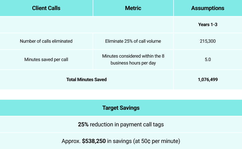
✅ An improved and concise experience should reduce payment related calls by 25%, saving the client time and confusion, and ultimately saving the company money.
✅ Increase the NPS (Net Promoter Score) by 1%
Success Metrics to Track
✅ Number of visits to Payment Center to Call Center
✅ XP (Experience) / NPS Scores
✅ Number of Autopay enrollments
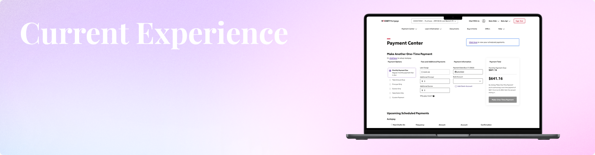
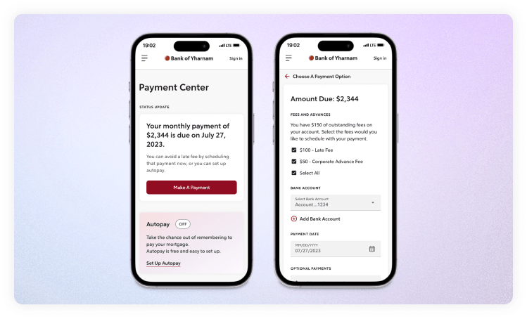
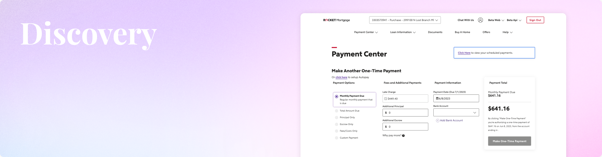
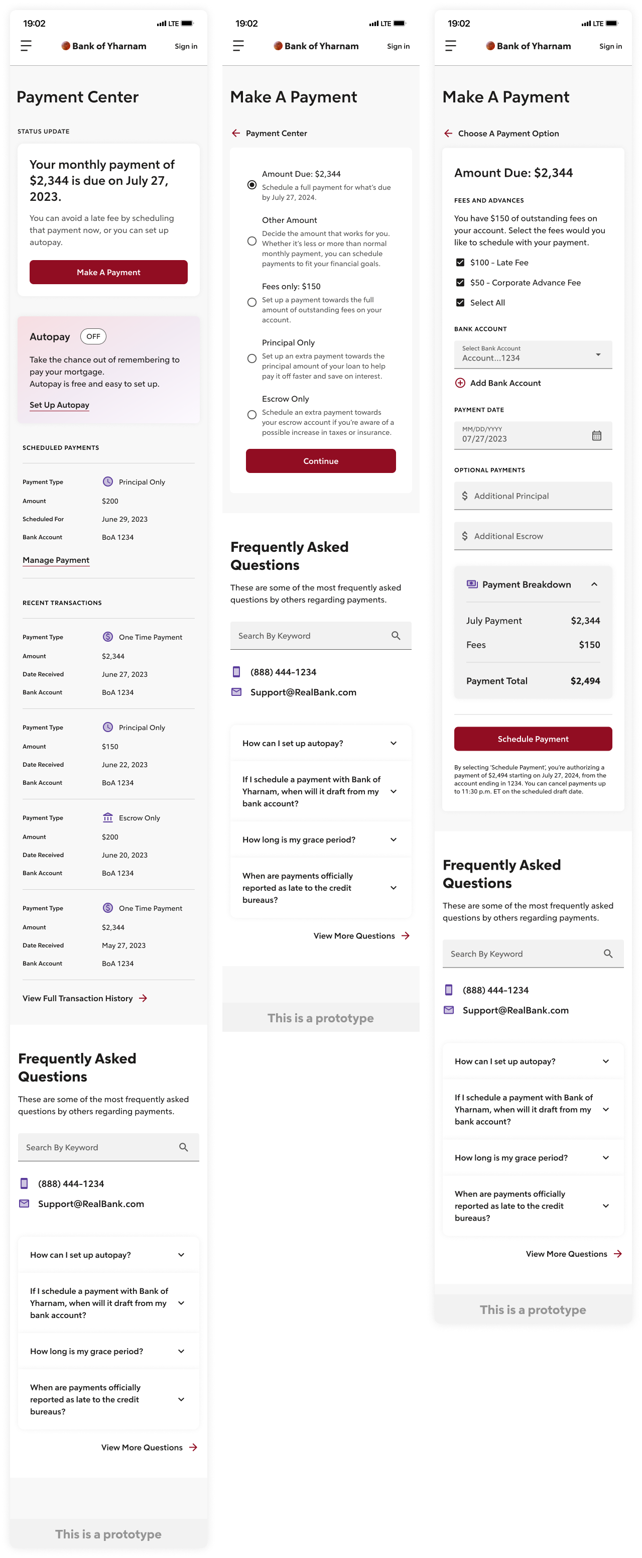
Current Experience Analysis
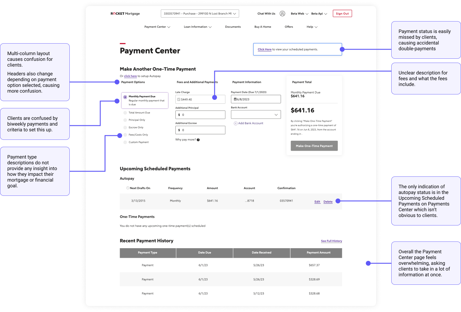
As one of the most important experiences within the RMS space, and the current-day experience offers a somewhat confusing flow and process. Pieces we evaluated to improve include:
- A multi-column layout, making it difficult for clients to focus on the right place.
- Payment status is difficult to locate and understand
- Criteria and value for Biweekly payments are unclear
- Payment type descriptions are unclear
- Fees and what they include are unclear
- Overall page is cluttered and overwhelming
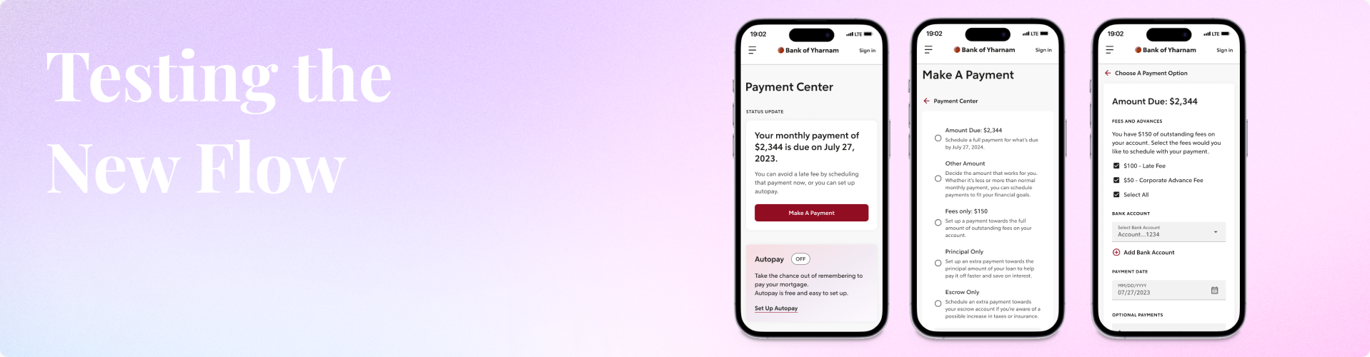
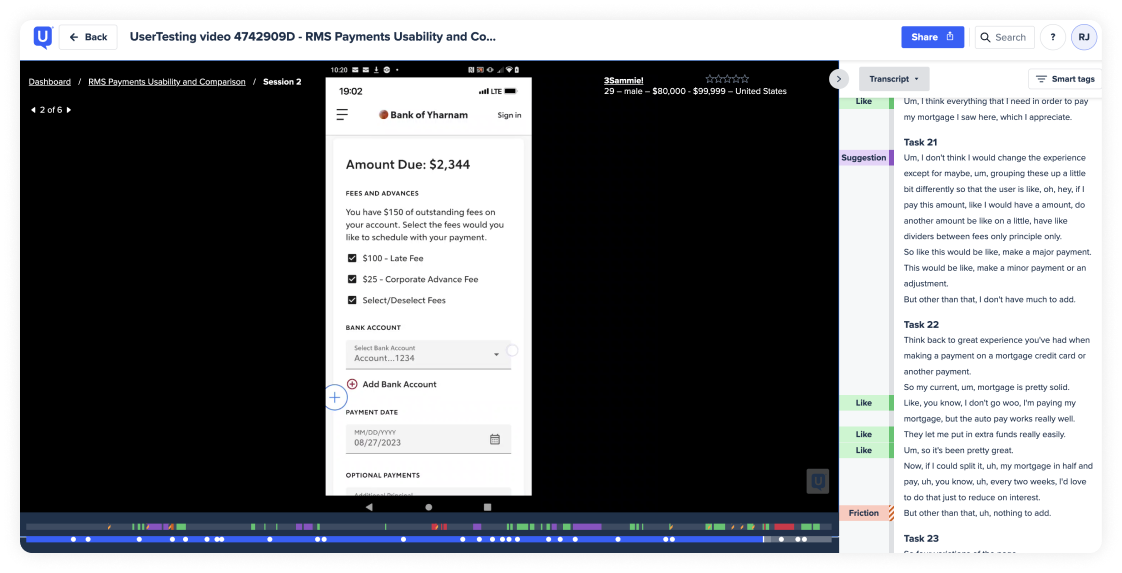
Usability and Comparison Testing
We had two potential tests we wanted to conduct, usability and a comparison test.
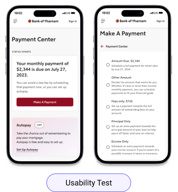
Usability Test: we wanted to take our revamped Payments flow and test it to understand any behaviors or expectations when making a payment on a mortgage.
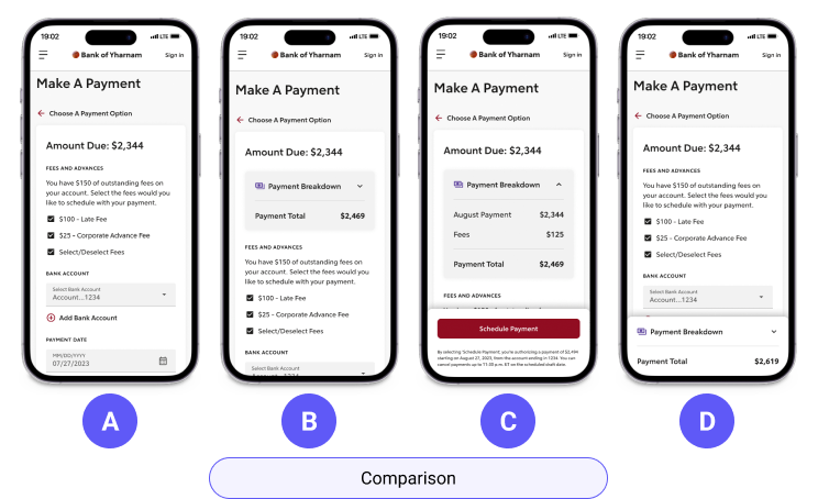
Comparison Test: we wanted to compare layouts to learn how clients may expect to view the hierarchy on a payment page, including a payment breakdown or summary.
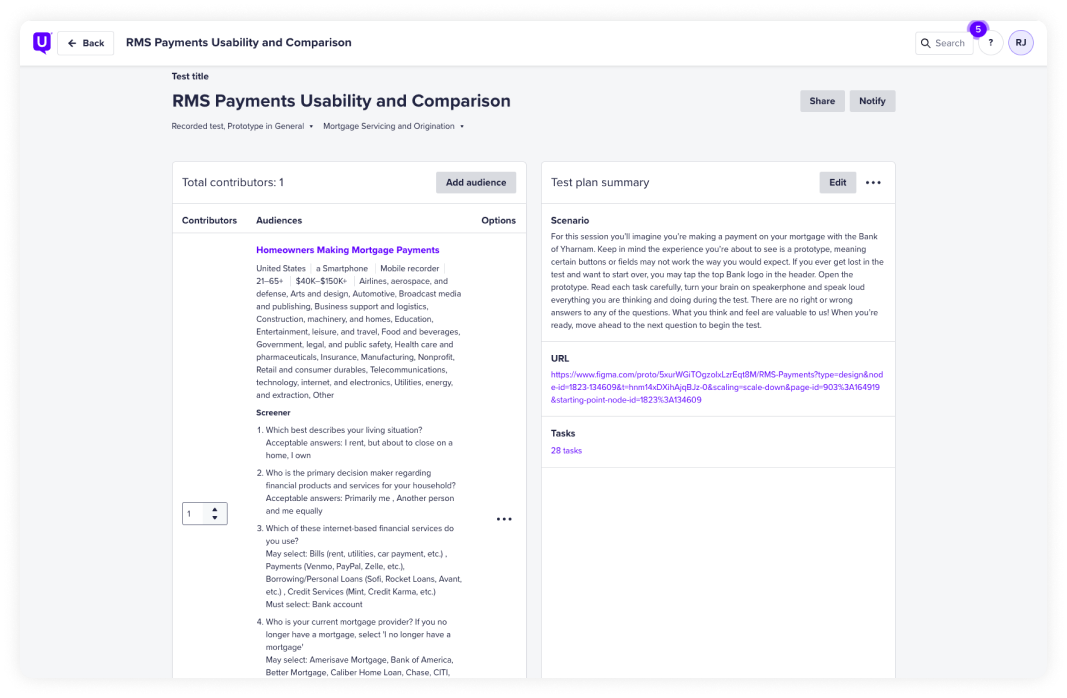
Combining Our Tests
Due to time constraints on the team, our researcher, Juliana, suggested we combine the usability and hierarchy comparison (removing the card sorting), in order to get quick and valuable results, while ensuring we avoid any test fatigue.
Key Updates to Designs
- Overall flow usability
- Actions and language used throughout, to ensure clarity
- Hierarchy within the make a payment screen
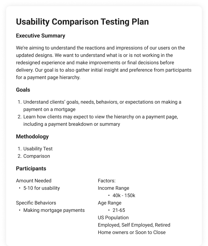
Final Participants
Total participants: 8
Age Range: 21–65+
Region: United States
Salary Ranges: $20K–$150K+
Behaviors: Home owners making mortgage payments
Tool: UserTesting.com
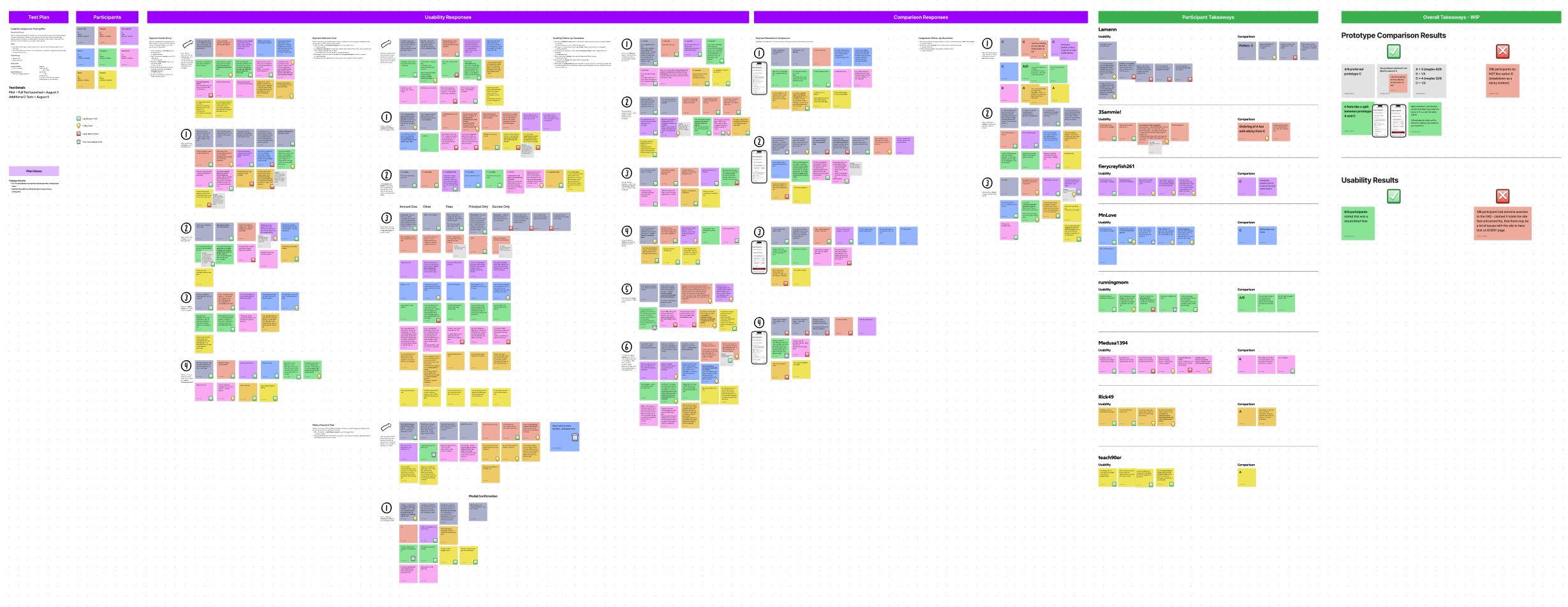
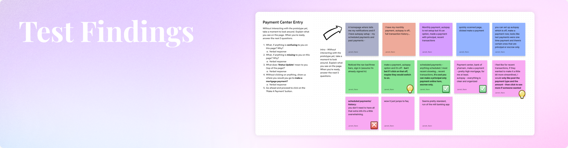
Usability Results
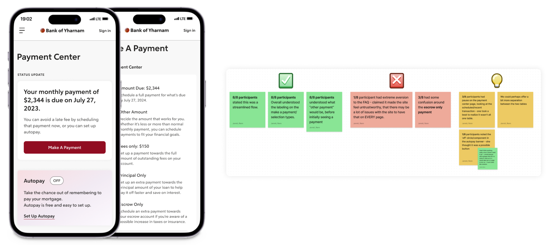
✅ 8/8 participants felt the flow was easy to use, and a streamlined experience.
✅ 5/8 participants overall understood the different methods or types of payments to choose from (amount due, other amount, fees only).
✅ 8/8 participants overall felt the labeling of the payment types was clear and concise.
❌ 3/8 participants had some confusion about the escrow only payment option.
❌ 1/8 participants had strong feelings that the FAQ section was way too frequent on all the pages and too large. Stating, “it shows up so frequently it makes me believe there’s something wrong in the experience.”
💡 Though 1 participant had strong feelings about the FAQ, we could consider removing in deeper pages of the experience to reduce noise.
💡 3/8 participants paused on the initial Payment Center page, reading through the scheduled payments and recent transactions tables – we could consider adding more sense of separation
💡 Though the overall labeling is considered clear for the payment options, we could consider adding clarity for the Escrow Only payment option.
Comparison Results

Prototype A = 3 (4)/8 votes*
Prototype B = 1/8 votes
Prototype C = 4 (3)/8 votes*
Prototype D = 1/8 votes
💡Many voted for C, but one who voted C specified they prefer the layout of A, but with the sticky button.
💡2/8 participants called out the hierarchy making more sense as you read it in A.
❌ 90% of participants did NOT like prototype D.
Design Recommendations
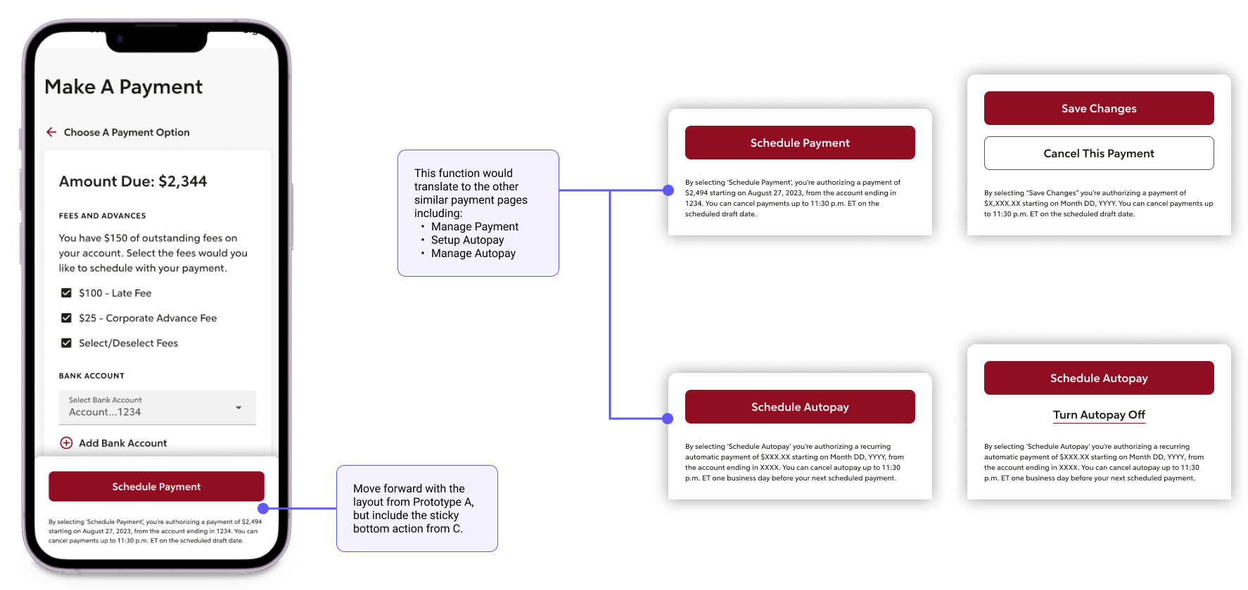
💡Consider moving ahead with the originally intended hierarchy for the Make a Payment Page, but add a sticky action for mobile.
This pattern would translate to additional payment-related pages:
- Manage payment
- Setup Autopay
- Manage Autopay
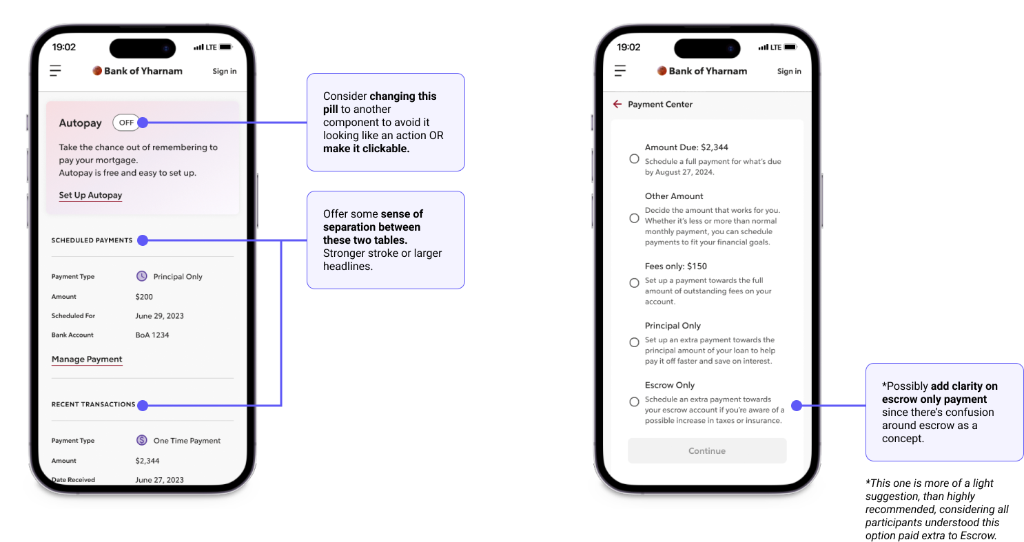
💡 Add separation to the scheduled payments and recent transactions tables on the Payment Center page.
💡Adjust or add clarity to the content for Escrow Only payment option to avoid confusion.
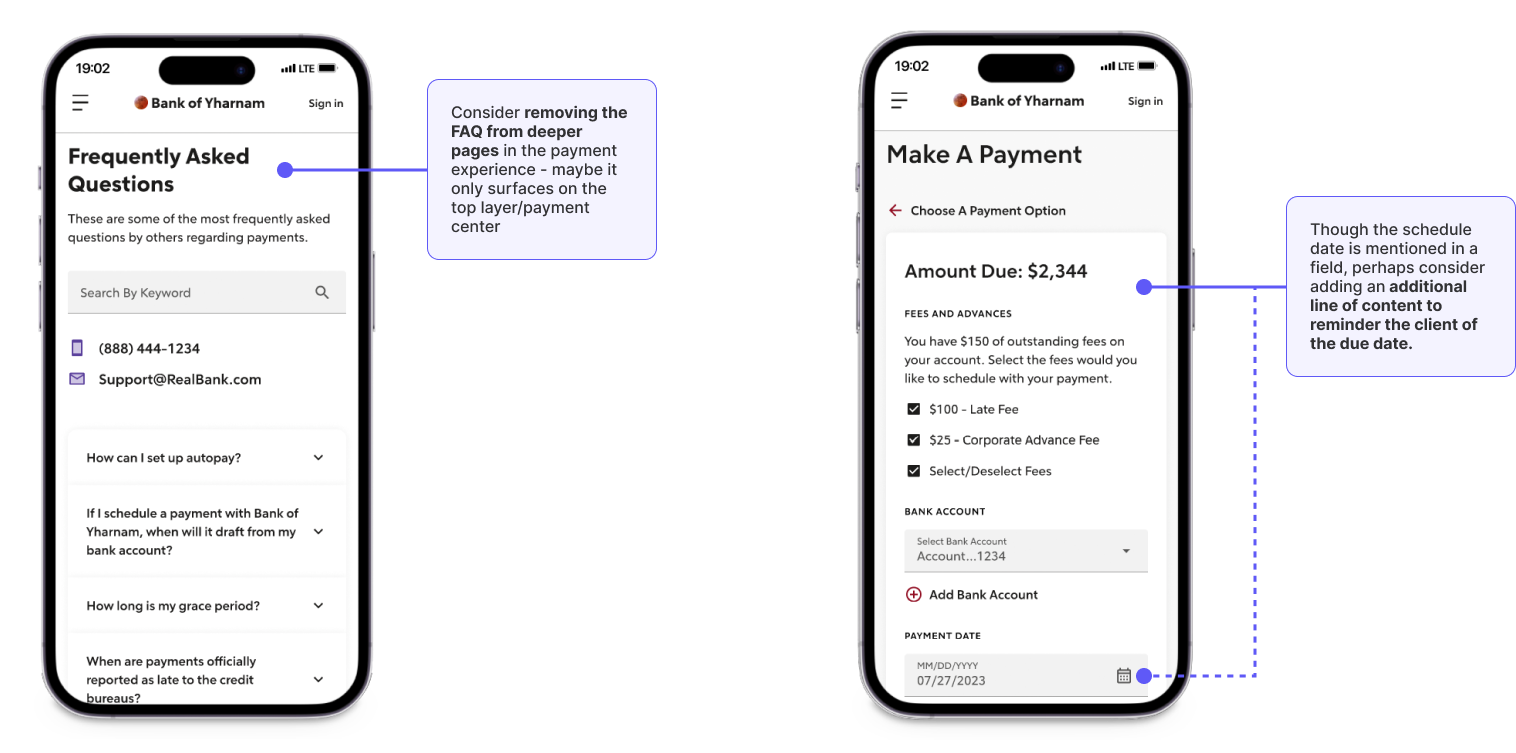
💡 Consider removing the FAQ from deeper pages in the experience to reduce noise.
💡 Add a line of content to offer a reminder to the client of the due date.
Final Thoughts
At the end of testing, I was preparing to leave the company due to a reduction in head count, so I wrapped up my recommendations for the team to pick up later at Rocket.
The payments experience in the Servicing space has been considered a priority item to be improved, so though I’ve left Rocket, I hope my findings are proved useful for the team members who pick it up!
©2023 COPYRIGHT ROCKET COMPANIES ALL RIGHTS RESERVED. DO NOT COPY OR DUPLICATE
