
Case Study:
Loan Offer Selection Experience Testing
Tests Conducted: May/June 2023
2023 // Rocket Companies
My Role // Staff Experience Designer + Researcher
Design/Research Lead:
Myself (Staff UX
Research Consults:
Alex Panganiban, Dan Van Vleck
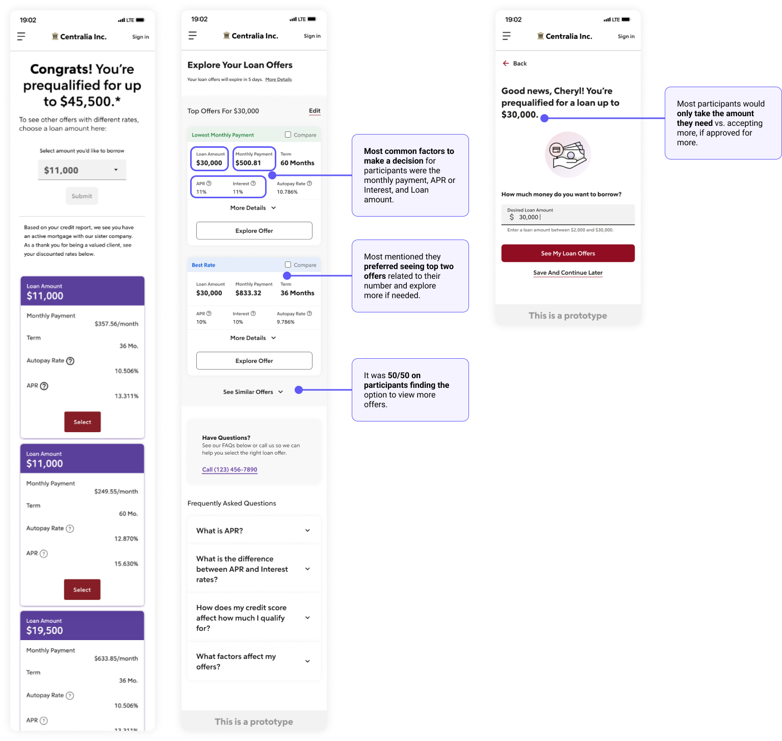
First Designs
We were able to compile these takeaways for both experiences and captured ideas and assumptions on how we can begin iterating on an updated offers flow.
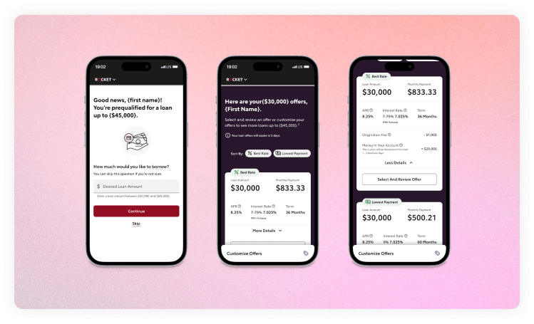
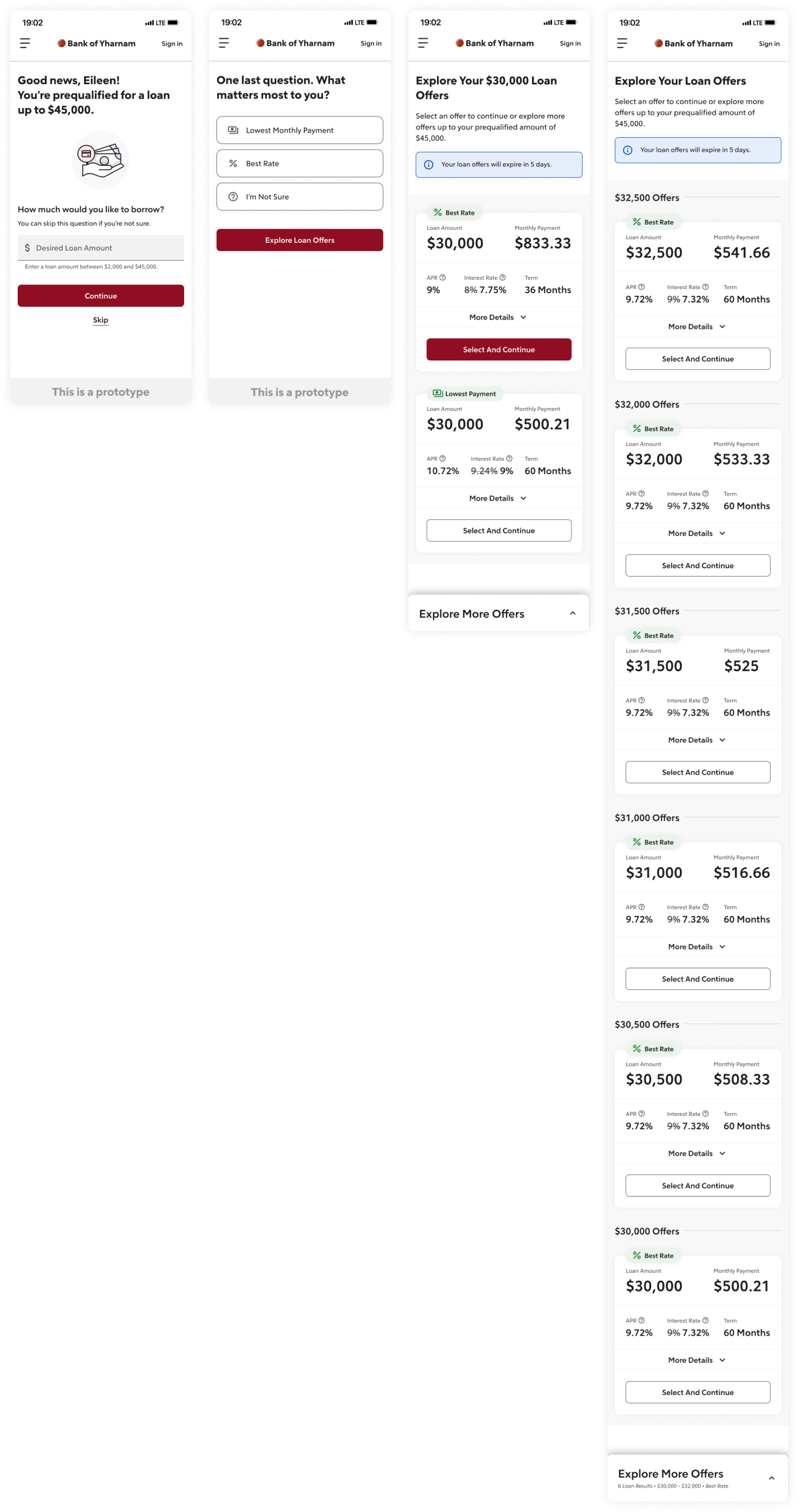
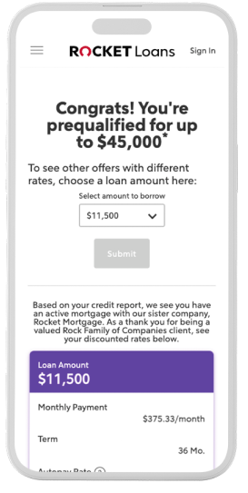
- We introduced a prequalified amount screen with the opportunity to input a desired amount, since this isn’t currently offered in the application, today.
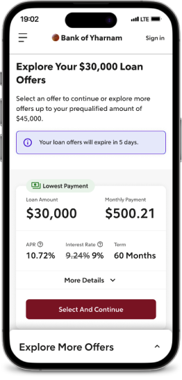
- Explored top two offers, based on the two terms Rocket offers (36 or 60 months).
- Offered the ability to filter in more offers with a “see similar offers” action.
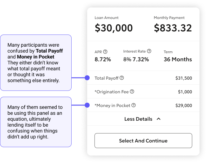
- Introduced certain data in the offer card to explain payoff, fees, and amount in pocket.
Key Areas to Test
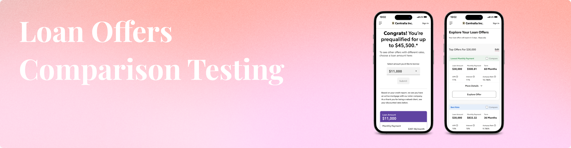
We conducted a comparison usability test, showing the current offer experience and our new experience, asking similar questions for each offer page to learn participants’ expectations and goals related to loan offers.
- Comparison between the current offers page and our new design (more vs. less).
- Reactions to a pre-qualified amount screen, before viewing offers.
- The hierarchy presented to applicants on the redesigned offers page.
Do testers understand how to view more offers? How to sort or filter?

Analyzing Results
I watched through the results and captured notes from the participants’, indicating areas that seemed to work well, where they struggled, or a test issue that we would likely need to ignore or fix for a future test.
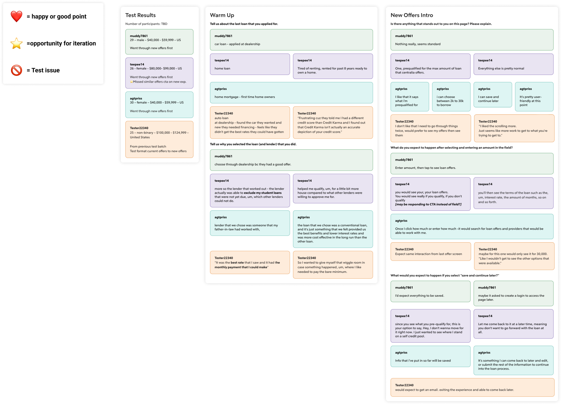
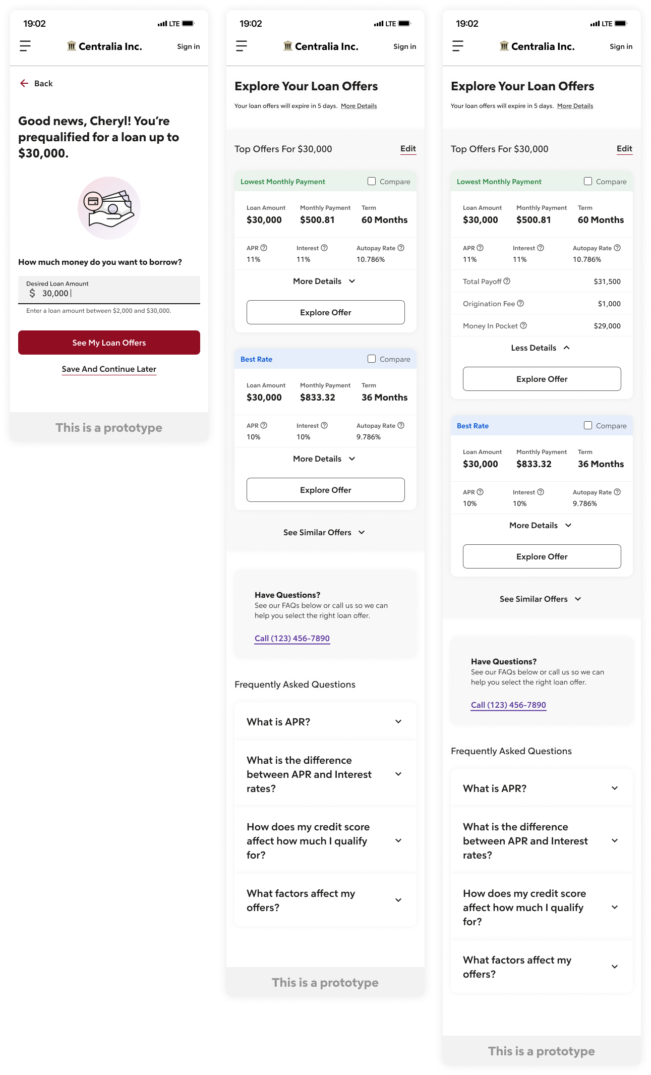
Key Takeaways – Round 1
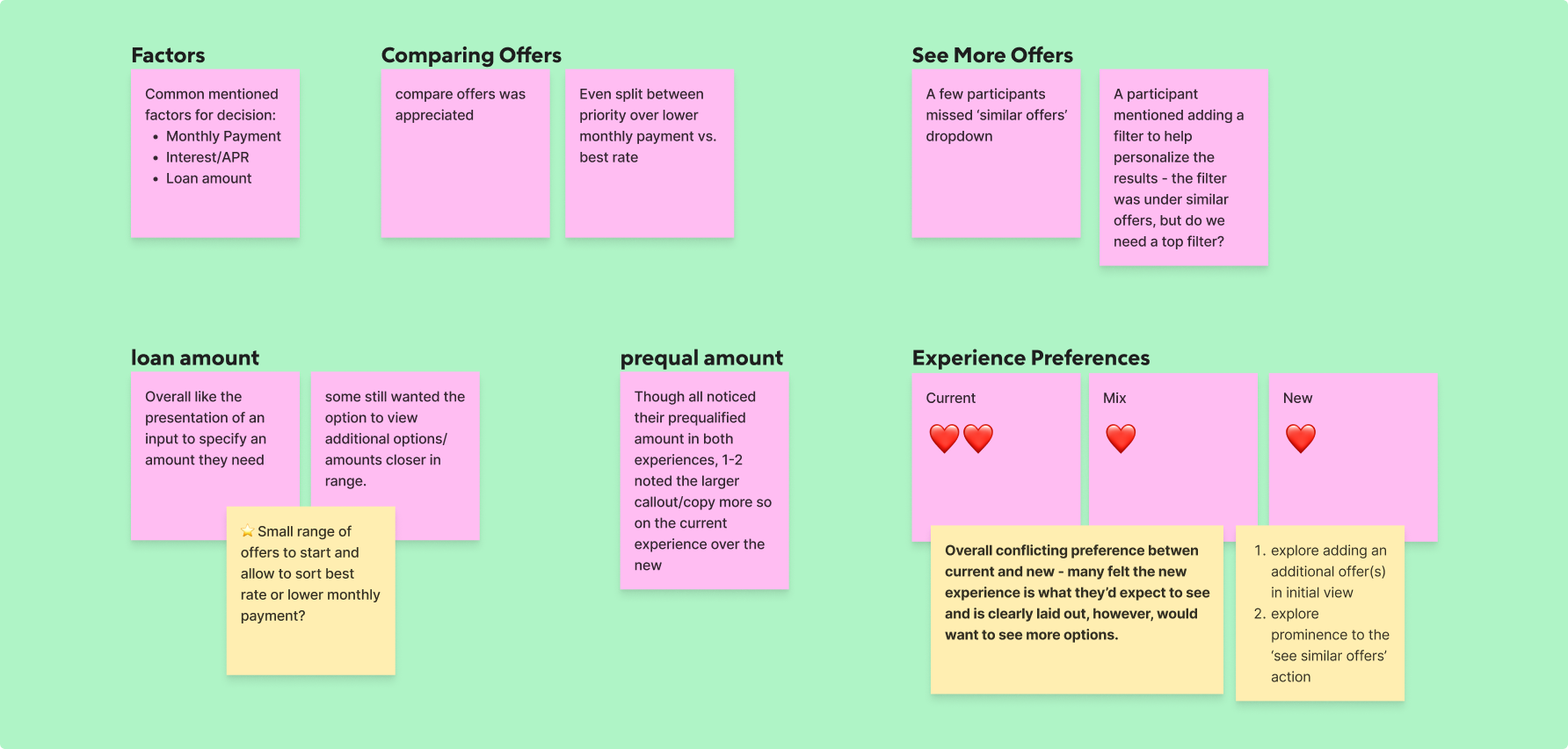
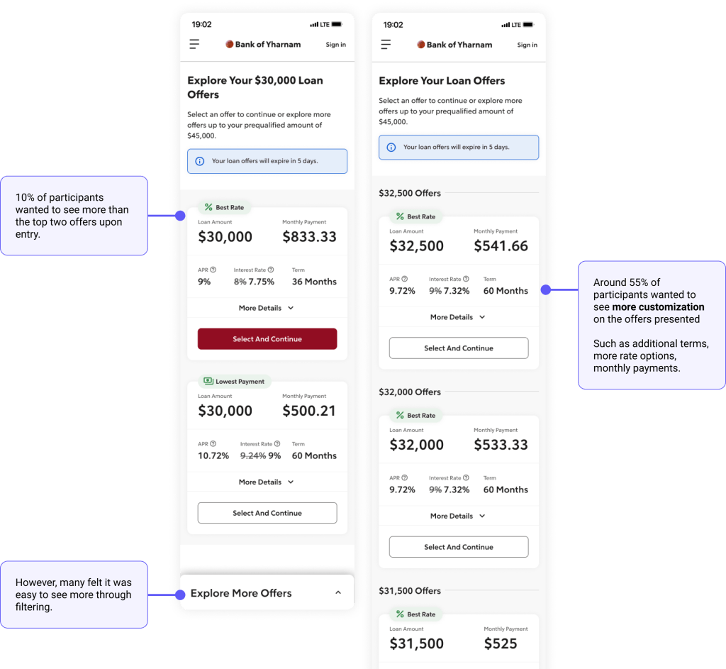
- It was split whether participants noticed the ‘see similar offers’ action in the new experience, meaning we could explore a more noticeable ways to surface this.
- A few mentioned they like the top two offers showing best rate and lowest payment options, related to their [desired] loan amount.
- Most participants would only take the amount they need vs. accepting more if approved for more, thus confirming our client-first experience by providing a way to input a desired amount.
- Confirmed the most common factors for the participants to make a decision on an offer included: the interest rate or apr, monthly payment amounts, and loan amount.
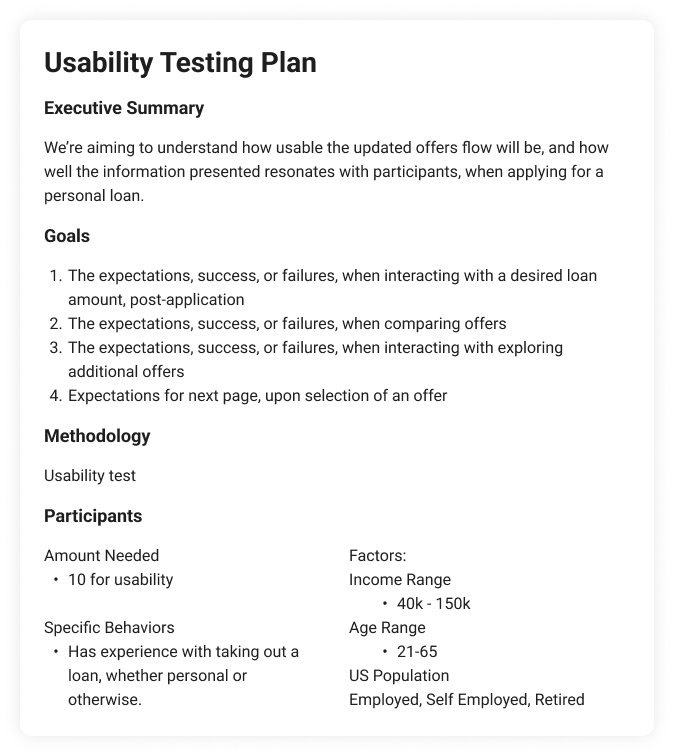
Usability Testing
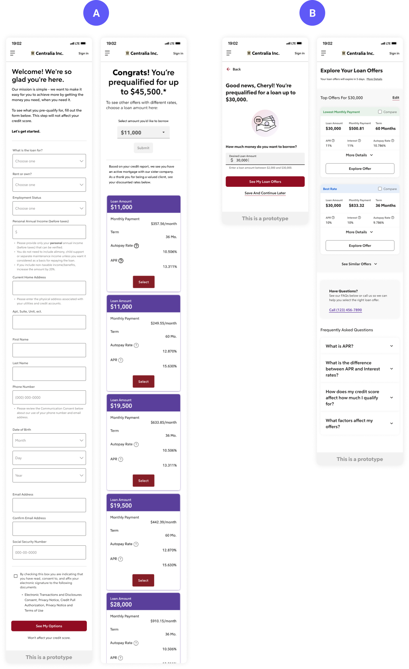
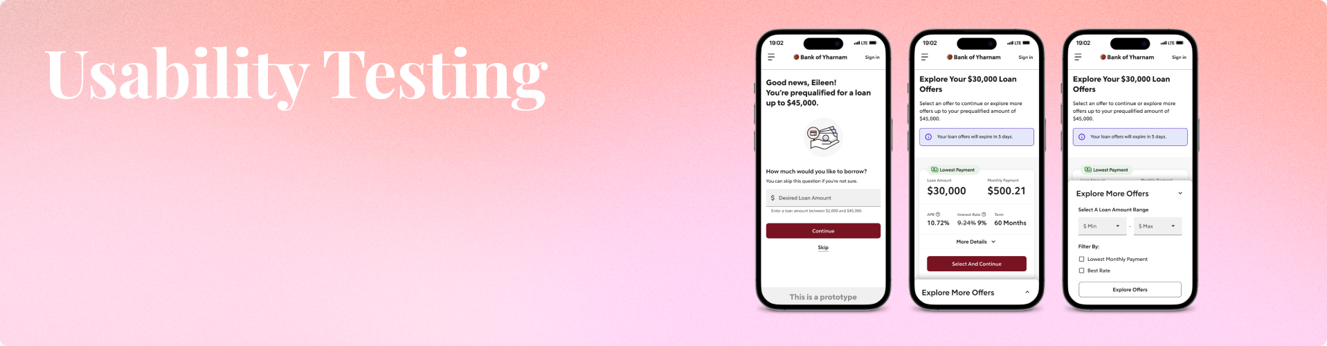
We wanted our second test to focus on the new experience, after the application process and entry to a pre-qualified loan amount, then usability within the offers themselves.
Key Design Updates
With our first test completed, we began to implement the feedback into a second iteration to test on, focusing more on the new experience and the usability.
Main areas updated in this next design include:
- A step for the applicant to select a factor (best rate, lowest payment)
- Simplified cards with clearer hierarchy
- A panel for clients to explore more offer options
Key areas to test:
- Full usability of the entire flow from application to offer selection
- Tasks to prompt them to talk through the amount they’d move ahead with, how they would view more information, and filter to see more results.
Design Takeaways

Big Win
❌ Testing the original/current offers experience, only 30% of participants would move forward with an offer presented.
✅ In our new flows, that comfort-level to move forward with an offer increased to 80% selection rate.
Check out the full Case Study
©2023 COPYRIGHT ROCKET COMPANIES ALL RIGHTS RESERVED. DO NOT COPY OR DUPLICATE
